Responsive Websites: Hey there! If you’re running a website in 2025 (or planning for 2026), you’ve probably heard that Google is all about mobile these days. And honestly, it’s no surprise—over 60% of searches happen on phones and tablets. But here’s the thing: responsive websites aren’t just nice to have anymore. They’re a key reason why some sites climb the Google rankings while others get left behind.
As someone who’s been optimizing sites for search engines for years, I’ve seen firsthand how a solid responsive web design can boost visibility and traffic. In this post, we’ll dive into why responsive websites help you rank higher on Google, especially as we head into 2026. We’ll cover the basics, Google’s evolving rules, and practical tips to get your site ready.
What Is a Responsive Websites?
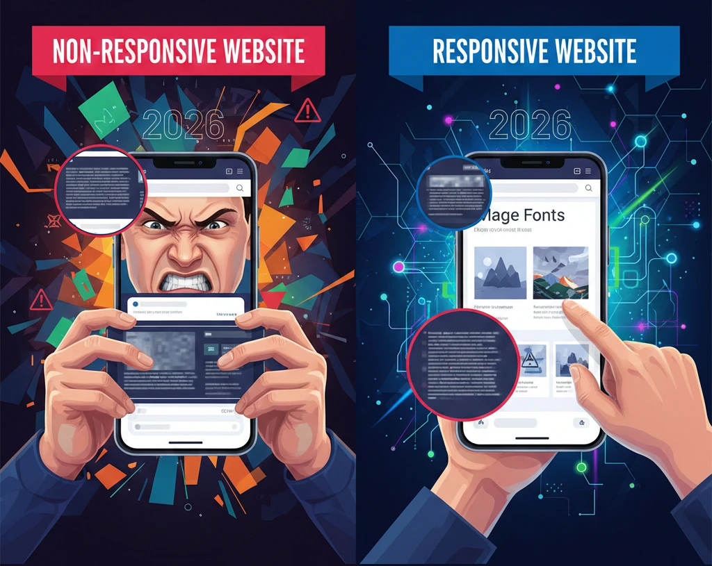
Let’s start simple. A responsive website automatically adjusts its layout, images, and content to look great on any device—whether it’s a big desktop screen, a tablet, or a smartphone. No pinching, zooming, or sideways scrolling needed.
Unlike old-school sites that might have a separate mobile version (like m.yoursite.com), responsive web design uses the same URL and code for everything. Google loves this because it’s easier to crawl and index.
But the real magic? Responsive websites create seamless experiences for users. And Google prioritizes user experience above almost everything else when deciding Google rankings.
Google's Mobile-First Indexing: The Game-Changer for SEO in 2026
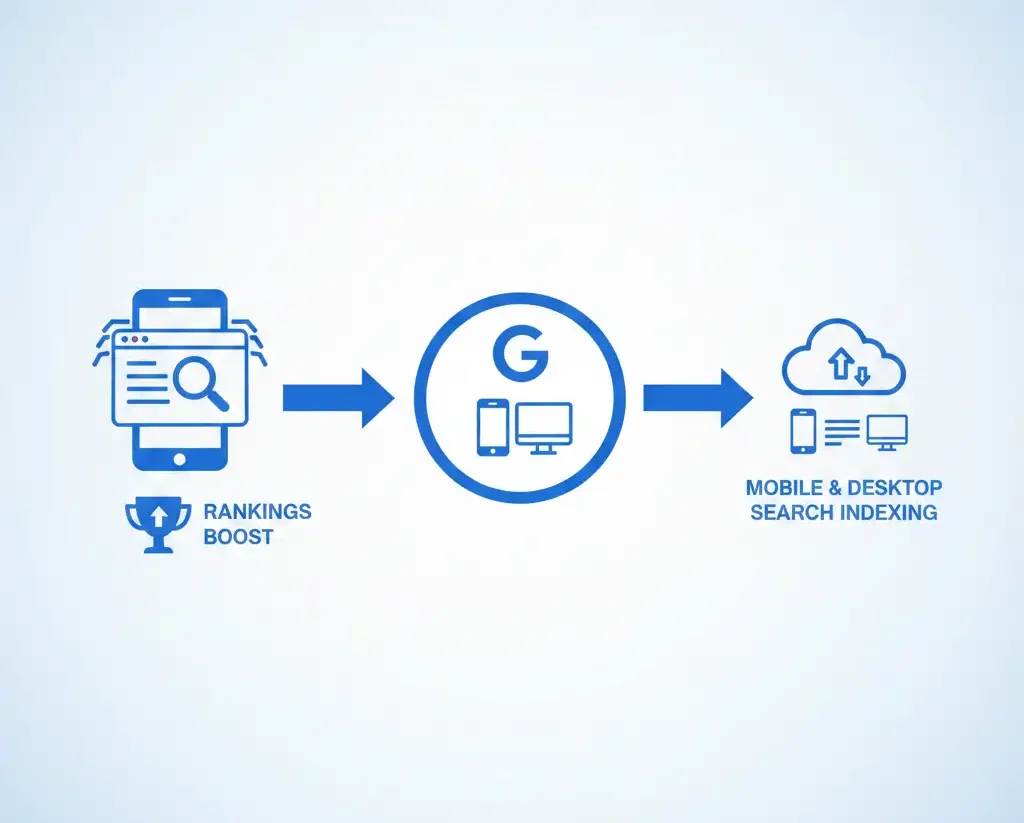
Back in 2018, Google started shifting to mobile-first indexing. By 2025, it’s fully the standard—meaning Google primarily crawls and indexes the mobile version of your site, even for desktop searches.
If your site isn’t mobile-friendly, you’re basically handing rankings to your competitors. Non-responsive sites can see drops in visibility because Google assumes mobile users (the majority) will bounce off quickly.
Looking ahead to 2026, this isn’t changing. With mobile traffic only growing, sites without responsive web design will struggle to rank higher on Google. Google’s own documentation recommends responsive design as the top way to build mobile-friendly websites.
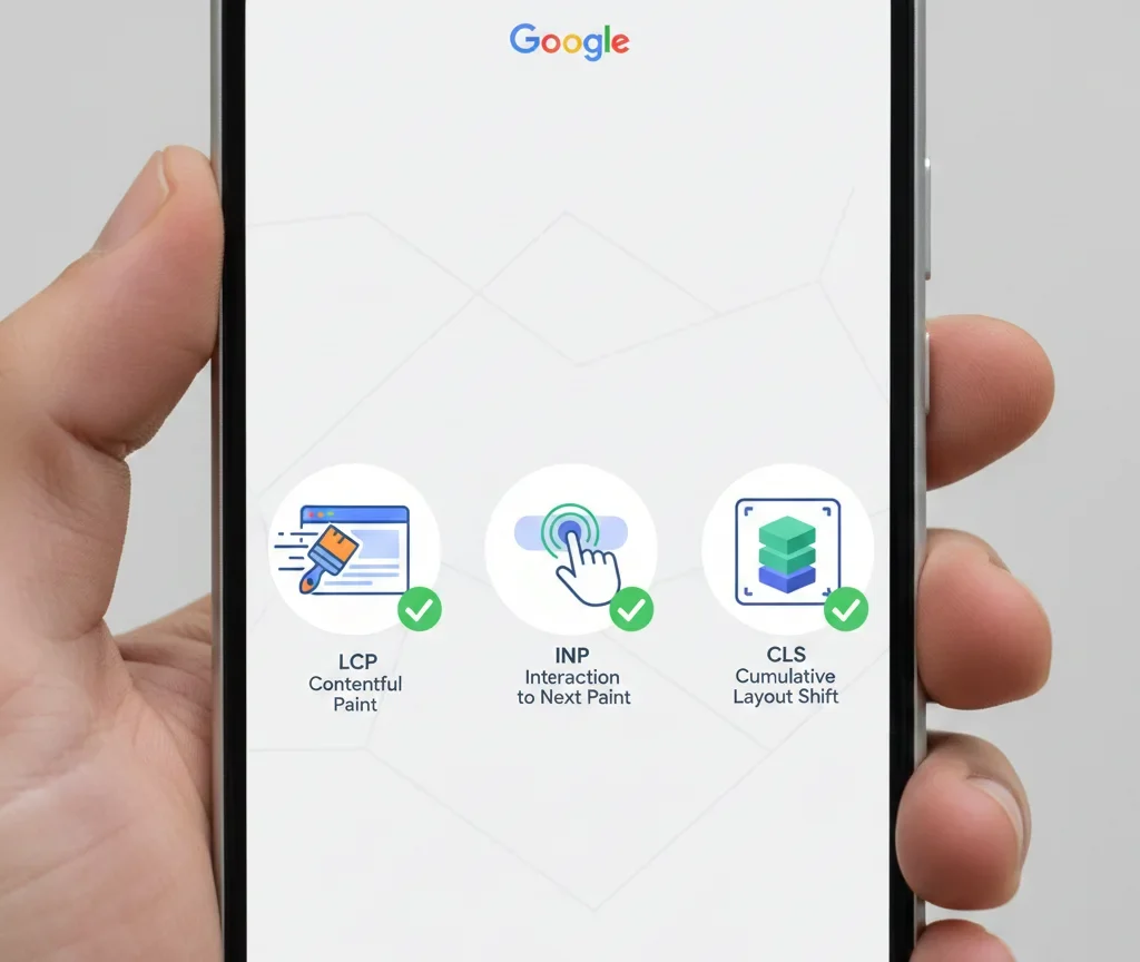
How Core Web Vitals Tie Into Responsive Design and Rankings
One big reason responsive websites rank higher? They naturally perform better on Core Web Vitals—Google’s key metrics for user experience.
These include:
- Largest Contentful Paint (LCP): How fast your main content loads (aim for under 2.5 seconds).
- Interaction to Next Paint (INP): How quickly your site responds to taps and clicks (under 200 milliseconds is good).
- Cumulative Layout Shift (CLS): How stable your page is—no annoying shifts as things load (under 0.1).
A well-built responsive site avoids common pitfalls like oversized images or poor layouts on small screens, leading to faster loads and better stability. Sites passing Core Web Vitals often see ranking boosts, especially in competitive searches.
In 2026, expect even more emphasis here as Google refines its page experience signals.
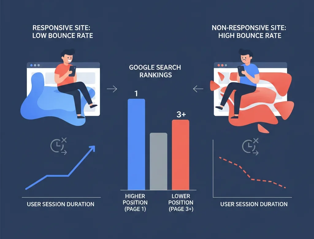
User Engagement Signals: Lower Bounce Rates = Higher Rankings
Think about it: When someone lands on your site from a mobile search and everything fits perfectly, they’re more likely to stick around, read, and convert.
Responsive websites reduce bounce rates and increase dwell time—both strong hints to Google that your content is valuable. These behavioral signals influence Google rankings more than ever.
On the flip side, non-mobile-friendly websites frustrate users, leading to quick exits and lower positions in search results.
The Future of SEO in 2026: Mobile-Friendly Is Non-Negotiable
As we move into 2026, SEO trends point to even tighter integration of mobile performance. With AI overviews and voice search on the rise, quick-loading, easy-to-navigate mobile experiences will separate winners from losers.
Google’s algorithms continue rewarding sites that put users first. And responsive web design is the simplest, most effective way to do that across devices.
For authoritative insight, check Google’s official guide on Core Web Vitals and their recommendations for mobile sites.
How to Make Your Website Responsive and Boost Your Rankings
Ready to upgrade? Here are actionable steps:
- Test Your Current Site: Use Google’s free Mobile-Friendly Test to spot issues.
- Adopt Responsive Design: If rebuilding, use flexible grids, media queries, and fluid images in CSS.
- Optimize Images and Speed: Compress files, use modern formats like WebP, and enable lazy loading.
- Check Core Web Vitals: Run reports in Google Search Console and fix problems like slow INP or high CLS.
- Avoid Common Mistakes: No Flash, proper viewport tags, and touch-friendly buttons.
For more on technical SEO, see our [Related Blog: Core Web Vitals Optimization Guide] or [Service Page: Website Design Services].

Invest in Responsive Design Today for 2026 Success
In 2026, responsive websites won’t just help you rank higher on Google—they’ll be essential for survival in search results. By focusing on mobile-friendly websites and responsive web design, you’ll improve user satisfaction, meet Google’s standards, and drive more organic traffic.
Don’t wait for a rankings drop. Audit your site today and make the switch to responsive. Your future traffic (and conversions) will thank you!
Ready to make your site responsive and SEO-ready? Contact us for a free audit—let’s get you ranking higher in 2026!